Every month the Army Public Affairs Office asks my team to produce a microsite to highlight a specific campaign/initiative that is being promoted to public audiences. There are 4 different templates/types of featured microsites; heritage, events, valor, and resources, and none of them are responsive.
Naturally, since March is Women's History Month, I was instructed to redesign a heritage microsite that brought awareness and commemorated the role of women in the Army. In addition, I was told that the design I came up with would become the new template applied to all heritage sites so I needed to create flexible UI interface components that would lend themselves to be utilized with a diverse amount of content.
SOLUTIONS
INTRO - a intro promotional plug
Despite offering the client with various other solutions, they were very GUN-HO on featuring all army.mil content relating to each microsite on an landing "intro" page . While I had initially planed for the news, videos, and related links to be on a resource page, I had to compromise due to the client demands, and re-worked laying out the content into distinct sections and styling a responsive video player to pull in army.mil playlist from Youtube.
PROFILES - a recognition of first-timers
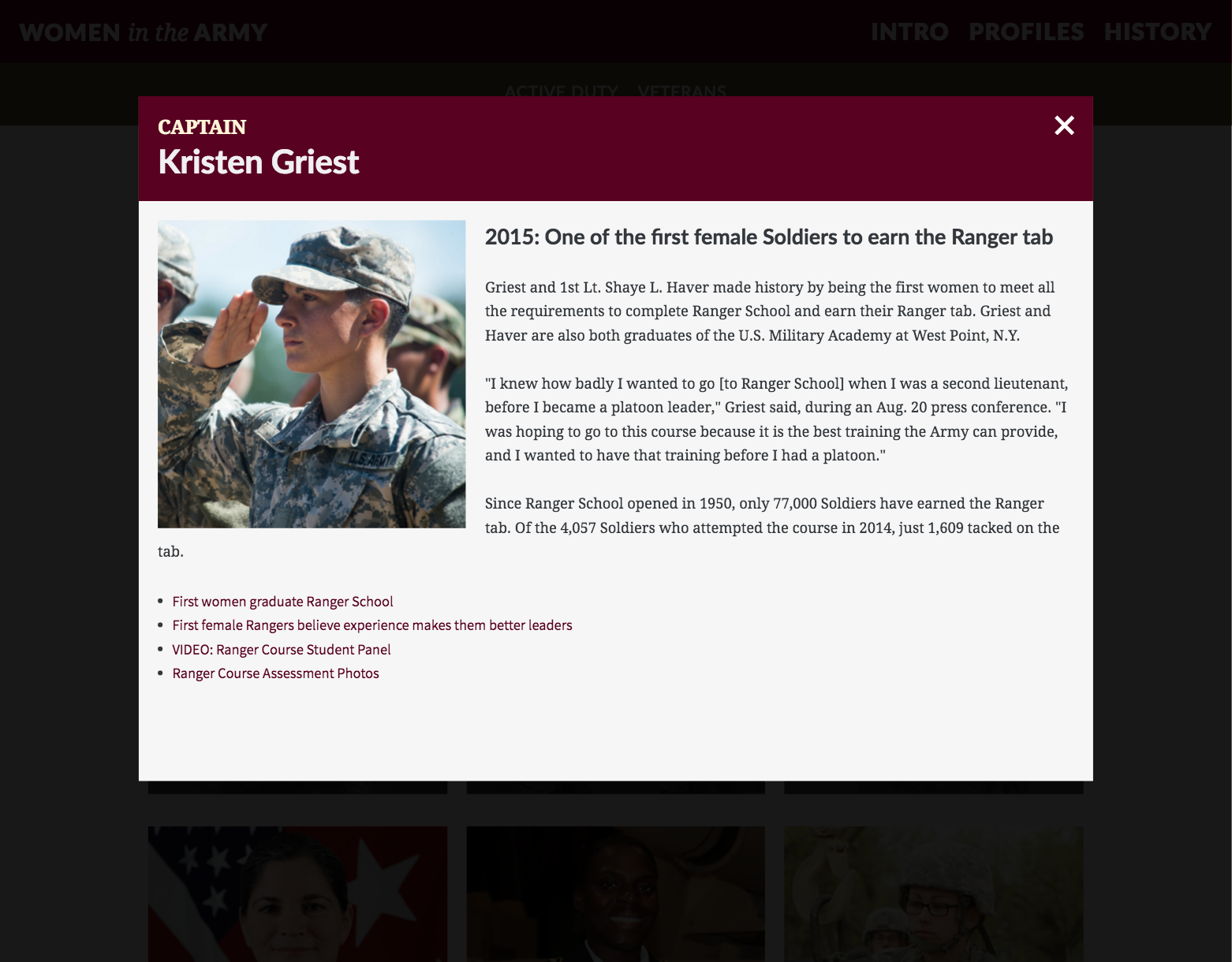
Profiles was another established page of the new heritage microsite template, that featured individuals who were the first of their kind (race,gender) to achieve something in the military. I kept the design to simple modular block elements that featured the individuals rank, name, official photo, and gave a short sentence on why they are important. If a user choses to read more a pop up will appear and they can read additional background details.
HISTORY - an interactive storytelling experience
After reading over the 30 page long google doc of historical copy text the client provided to me, I decided the most appropriate approach to tell this story was through an interactive timeline. However, I was concerned that a user would find the content overwhelming and abandon it quickly, if not presented in an easy, scannable fashion. I quickly initiated another meeting with the client and suggested tweaking the content according to industry best practices in order to make it more digestible for our defined users. While they were unwilling to budge in reducing the amount of copy, I was able to work out a strategy of structuring the content in a way that fit both the readers and organization needs while still offering an immersive experience.
Heres what I came up with:
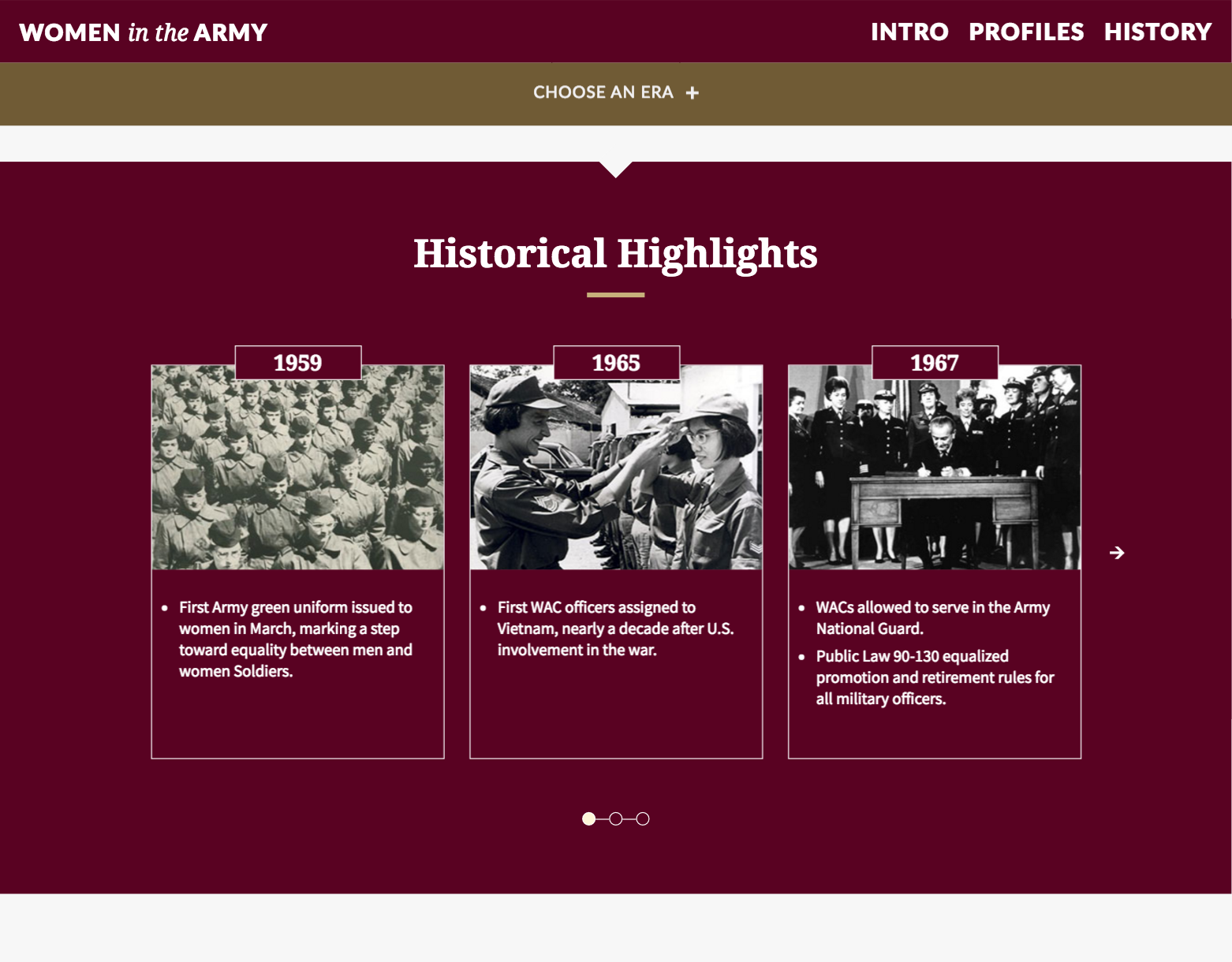
First, I organized the content into 10 specific chapters, and added a secondary navigation bar as a way for the user to seamlessly scroll to the desired section of their choosing. In each chapter, a sub header and short bite-sized paragraph summarizes the focus of the period, and gives the user an option to read more. This is followed by a historical highlights section that quickly informs the reader about the most significant events + individuals of the era. When the read more button is selected, additional media and text is displayed and the user can read about all the in-depth details of the era. While my goal was to make the content easy to scan, I also focused on presenting the information in an interactive way in order to create a playful and visually appealing experience for the users. I incorporated flip cards that required users to interact with in order to learn more about a topic and implemented transitions, animations, and hoover effects to reveal other pieces of information.
Overall, in the grand scheme of things, the final design had many flexible and dynamic elements that allowed for a smooth migration process of other heritage microsites.
PROCESS (available upon request)
Due to a non-disclosure agreement, I am unable to share/elaborate further information on this project via online. Please contact me for follow-up questions.


