

PROJECT OVERVIEW
Objective: Create a new responsive blog template for TASB’s internal department blogs to migrate over to during redesign. Incorporate new design system library elements into comps.
My Role: Stakeholder Interviews, Requirements Gathering, Content Audit, CMS Strategy, Information Architecture, Sketches, Visual Identity, & Style guide, Wireframes, High-Fi Comps, Front-End Development, QA Testing, Accessibility Compliance
BACKGROUND
The TASB Risk Management Fund (RMF) is a collective self-insurance program that helps reduces the cost of operational risks for Texas school districts, community colleges, and other education entities. Since 2008, they have distributed a quarterly newsletter, called News & Views, that offers the latest and most relevant information about public education risk management.

Before: News & Views Featured Articles
Before: News & Views Article
THE CHALLENGE
Over the years, the newsletter experience had grown dated and audience engagement has dropped off. While, the majority of the content published in the newsletter is extremely useful and highly requested information, it is unfortunately not easily findable to users; due to being buried deep in an unsearchable archive.
REQUIREMENTS GATHERING:
After analyzing site analytics, auditing existing newsletters, and reviewing customer surveys, the organization internally decided to rethink their communications strategy and proposed transitioning all of their archived content onto a new blog product called InsideRM. Overall, their goal with this publication was to provide an approachable resource for members to help them reduce their claims.
STAKEHOLDER INTERVIEWS:
I began by conducting stakeholder interviews and determined that the primary target audience was a mix of Risk Managers, HR Managers, and Business Managers. It was also noted that a secondary audience of school Superintendents, and other district administrators (admins, transportation managers, etc.) should be considered.
After: Featured Posts Template
After: Article Page Template
KEY IMPROVEMENTS
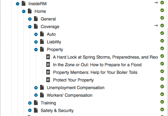
Content Structure View
1) EFFORTLESS INTERNAL MANAGEMENT
For our technical strategy, I focused on researching the backend capabilities of the Kentico content management system and decided to utilize the categories feature to outline the hierarchical page structure of the blog. Then, I meet with TASB RMF, to identify key terms/phrases (that would serve as categories and subcategories) in order to sort the large variety of content into appropriate, logical sections. It was important that the categories chosen were broad enough (future-proof) so that over the years they would still be applicable. This approach was simple enough for content authors (with no coding knowledge) to easily update and maintain. In addition, I built the blog in a way that supported growth (the continual addition of content) and was capable of evolving overtime.

2) INTUITIVE NAVIGATION
One of the main complaints received about News & Views was the lack of search functionality. While in a perfect world, that issue can normally be resolved through a search bar, the organization didn’t have enough hours left (aka money) to spend on my team flushing out the development of an advanced search feature. To resolve this shortcoming, I decided to use the previously established category and subcategory terms/phrases as main navigation items in order to give the user the ability to sort through different types of posts. For example, clicking on Training in the navigation will take the user to a page that displays just posts about training.
Another common frustration users had with the original newsletter was that there was no way to get back to the archived page once you selected an article to read. I approached this problem by keeping the main navigation bar consistent on every page and adding a secondary breadcrumb navigation element to allow users to see their location on the site; offering a quick way to return to the homepage.
3) FULLY RESPONSIVE DESIGN
Like most modern websites, the new InsideRM blog experience seamlessly scales across all device sizes, from smartphones to larger desktops, creating a more unified and consistent experience for the user. I designed 3 different page templates (Featured, Category, Article) on a flexible architecture and defined CSS media queries (for our library of styles, typographic treatments, and widgets) to reformat and optimize the site experience for audiences on mobile devices.
4) MODERNIZE LOOK & FEEL + ENHANCE READABILITY
Visually, the rebranding effort was an opportunity to experiment with RMF's brand identity for the upcoming redesign of the entire website. With the organization’s logo and color scheme as my jumping-off point, I developed a new design library of fluid responsive typography, interactive elements (buttons, links, nav) and custom illustrations.
5) ALLOW FOR ENGAGEMENT
Another feature we wanted to introduce was a way for users to share content. I created a sticky “toolbar” that included social media buttons and the option to email or print. This made sharing content easily accessible because the toolbar stayed visible as the reader scrolled up and/or down the page and was readily available for users to use at the most convenient moments; even on smaller screen sizes.
FINAL THOUGHTS
Overall, the design for this template was incredibly useful and successful for our readers and writers. It was an interesting challenge because technically there were 2 different types of users we were designing for on each end of the table. The people adding the blog posts into the CMS and the actually readers of the blog.
“I never thought adding stories could be so easy! I just click on the category and click new post and paste my stuff in. I am sooo excited about the ability to add images. This is hands down a game changer! ”
It earned the NSPRA’s Publications and Digital Media Award of Excellence.
Additionally, the design was so well-received that it became a template for additional blogs on the site. Check out HR Services Blog
To be able to measure success and drive post-launch optimization, a detailed analytics infrastructure was also put in place to look at user success (or not) across multiple dimensions and segments.
Improvements in KPIs after launch:
Bounce rate: 25% (reduced 53%)
Average Session Duration: 3mins 26secs (increased)
Engagement increase: 111% (increased)
Homepage Visits: Increased 40%
Due to a non-disclosure agreement, I am unable to share/elaborate further information on this project via online. Please contact me for follow-up questions.