

PROJECT OVERVIEW

Before Redesign: Homepage
BACKGROUND:
The Army website at www.army.mil is the face of the Army on the internet and is the primary communication & information tool that maintains constant contact with the Army’s audiences, the American people, and the world; 24 hours a day and 365 days a year. Ultimately, the last major overhaul of the www.army.mil was in 2009 and the Army needed to modernize its digital online presence to better address user needs and reflect it's current modern and progressive status.
OBJECTIVE:
Working in partnership with the Army Public Affairs Office, I worked to reimagine the Army’s official homepage—to analyze how visitors use the site and to consider the content they are seeking; to think about what the organization wants to communicate to visitors; and to build a more effective and engaging online experience.
CONSTRAINTS:
I experienced many creative constraints due to the limitations of the Army's homegrown content management system (CORE) that was still using outdated and unsupported legacy technologies. This made it crucial for me to communicate and consult with our developers on every facet of new functionality and continually run browser testing because the design needed to be optimized and compatible for IE9. (typical government requirement) In addition, I needed to make sure all design elements were in compliance with 508 accessibility standards.
MY ROLE:
Discovery: Stakeholder Interviews, Ecosystem Map, Opportunity Workshop, Content Audit, Analytics Review, User Surveys, Competitive Analysis
Define: Information Architecture, Key Goals & Recommendations
Design: Sketches, Pattern Library, Wireframes, High & Low Fidelity Comps, Usability Testing
DISCOVERY
Insight Exercises
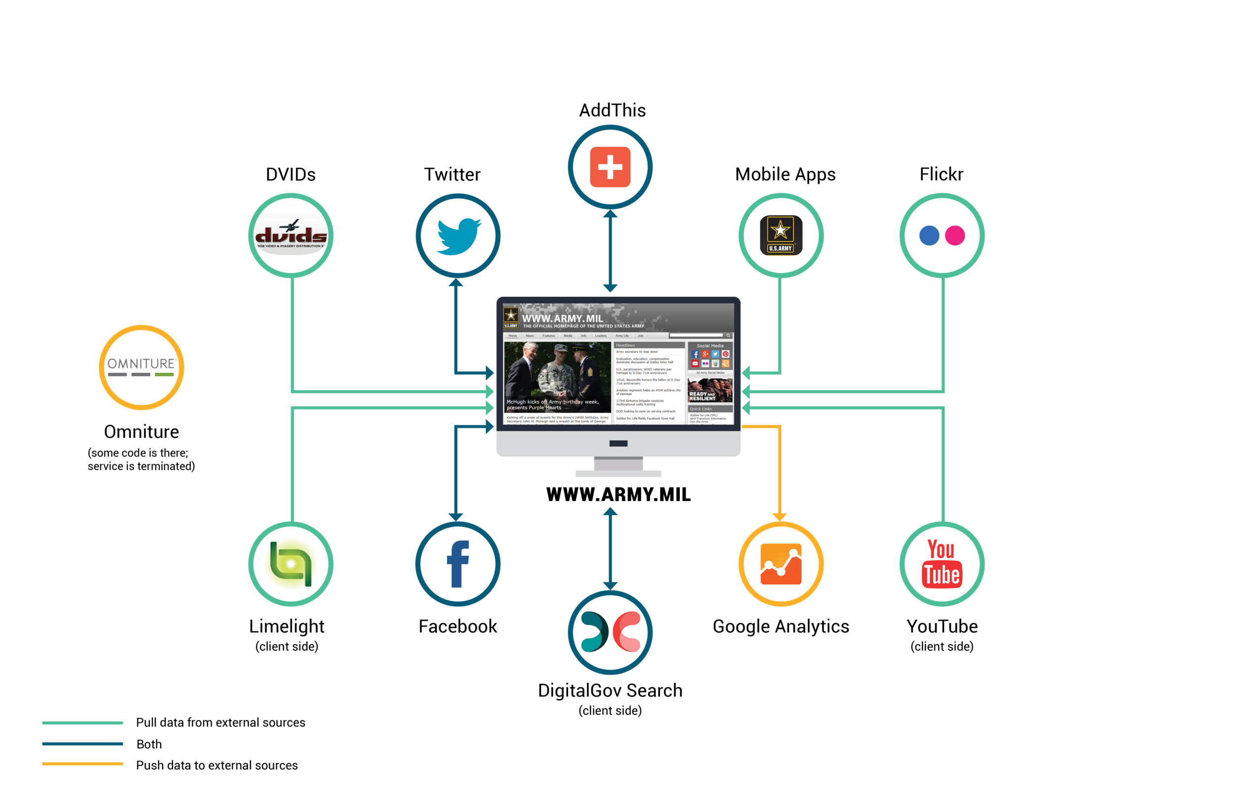
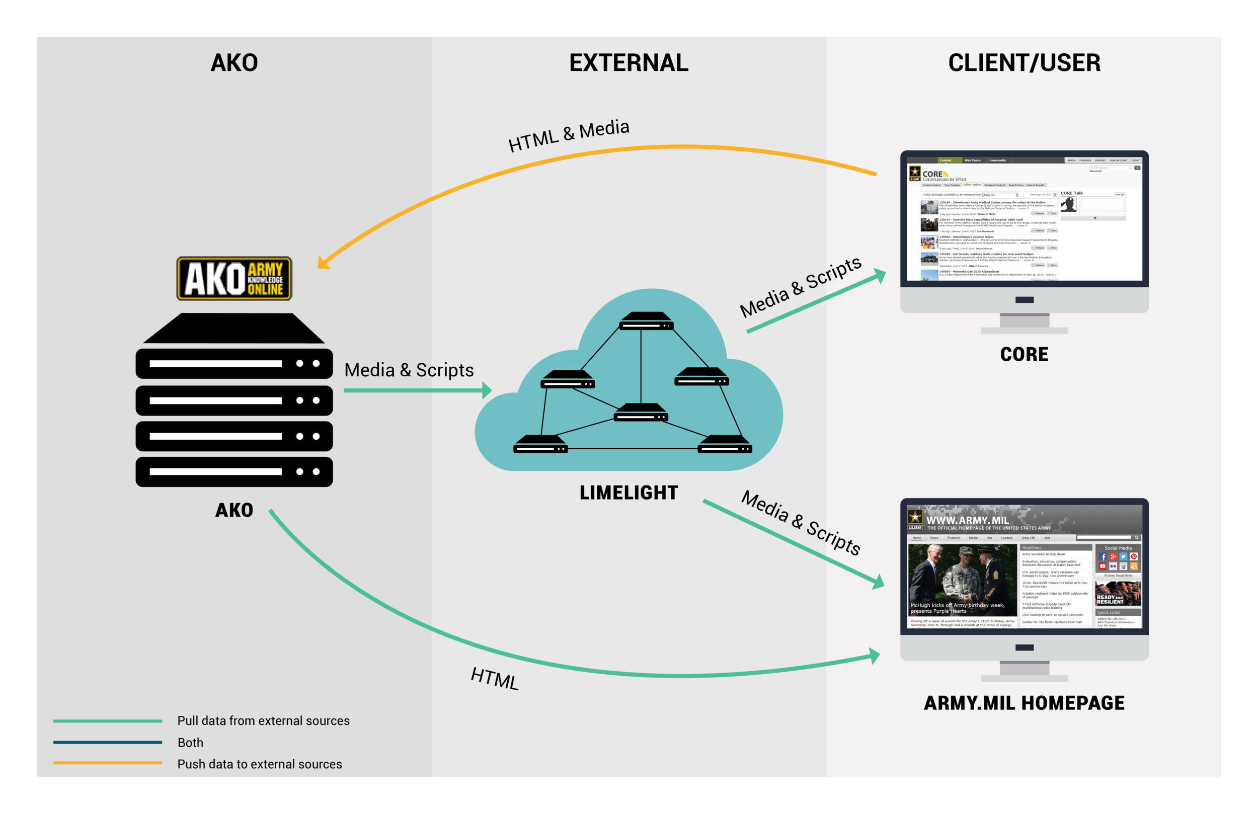
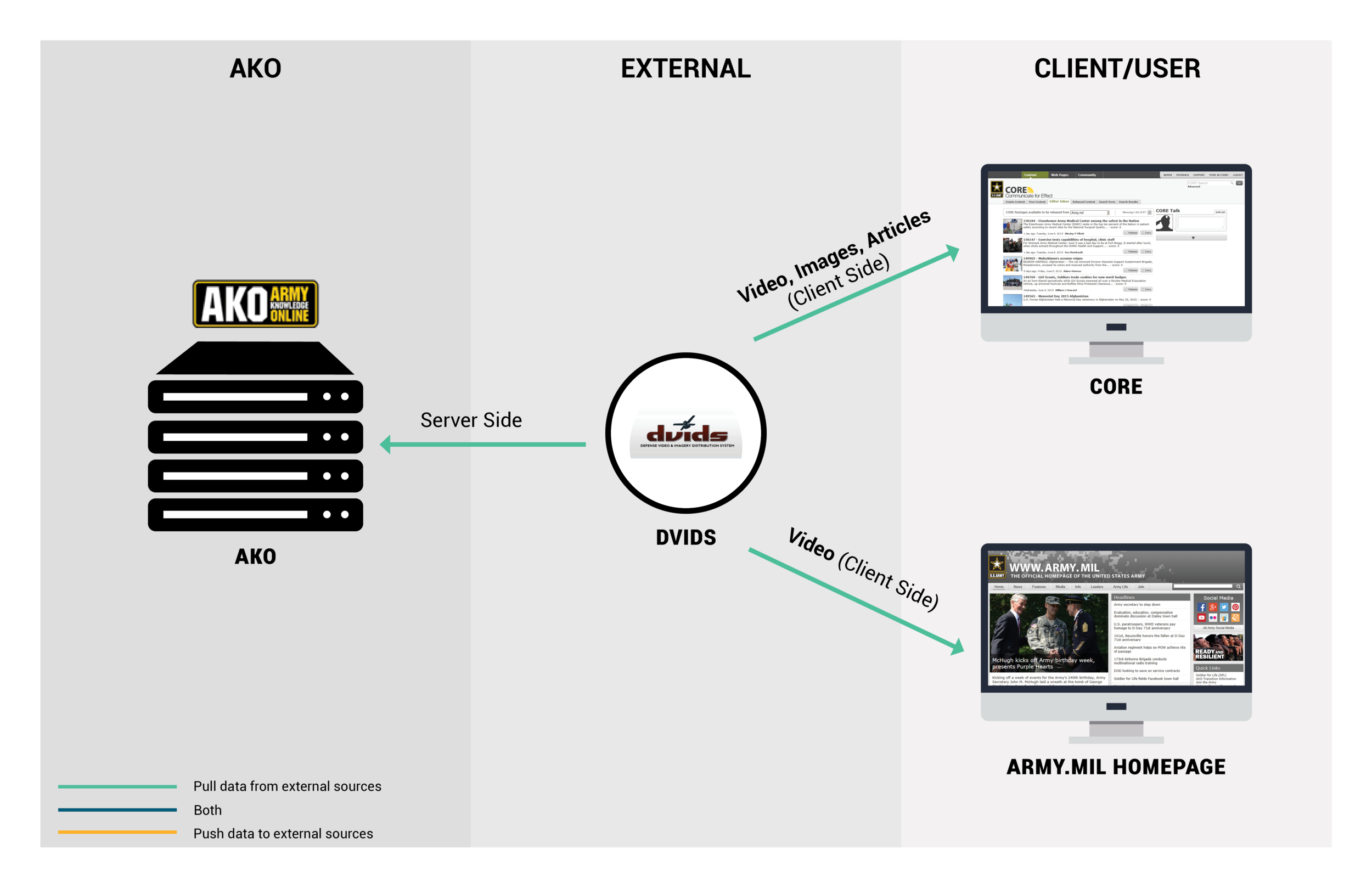
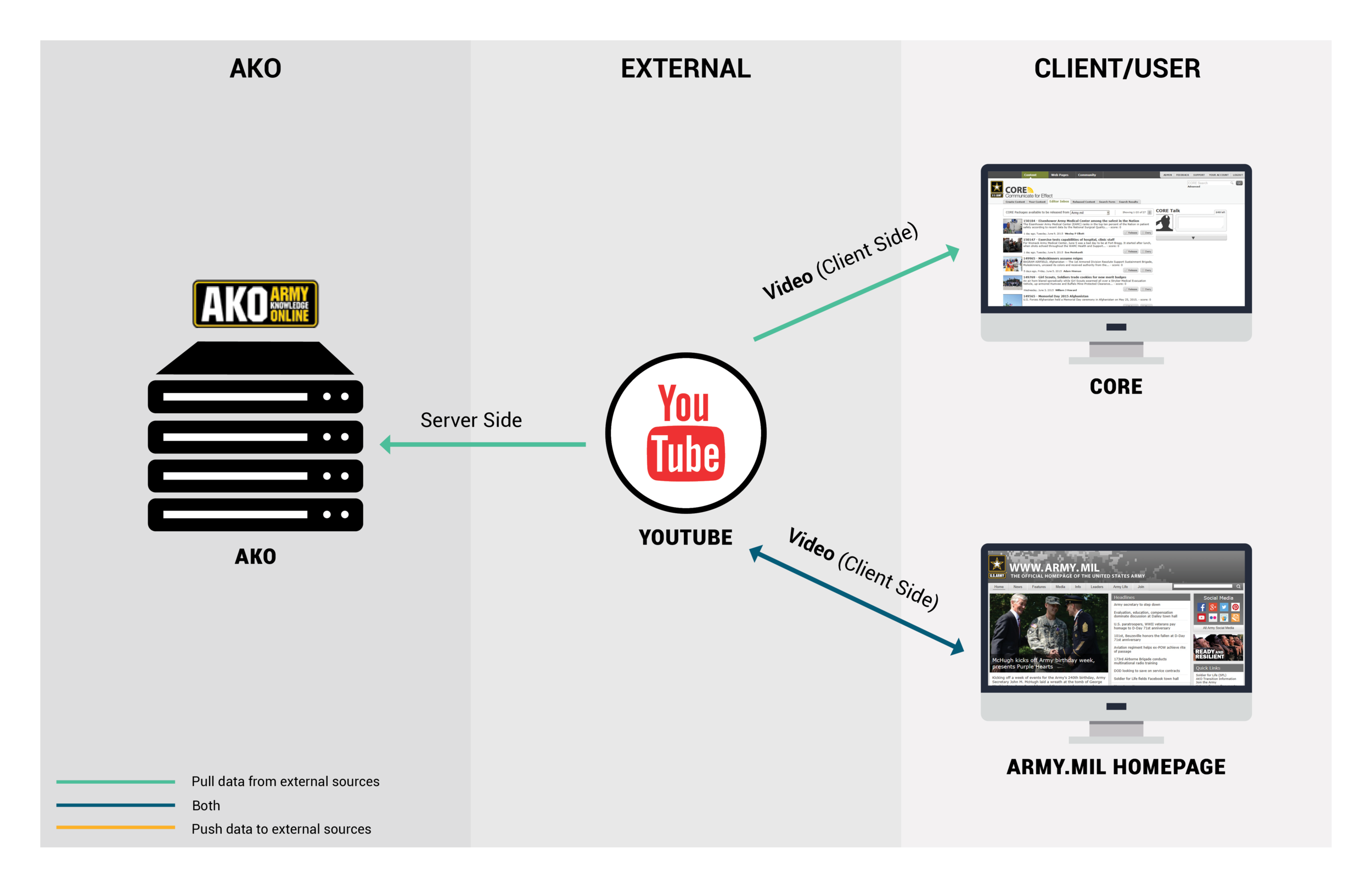
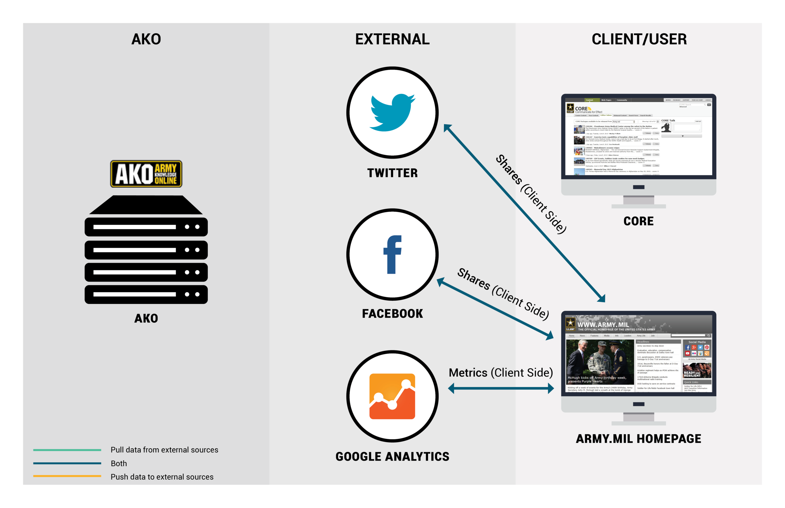
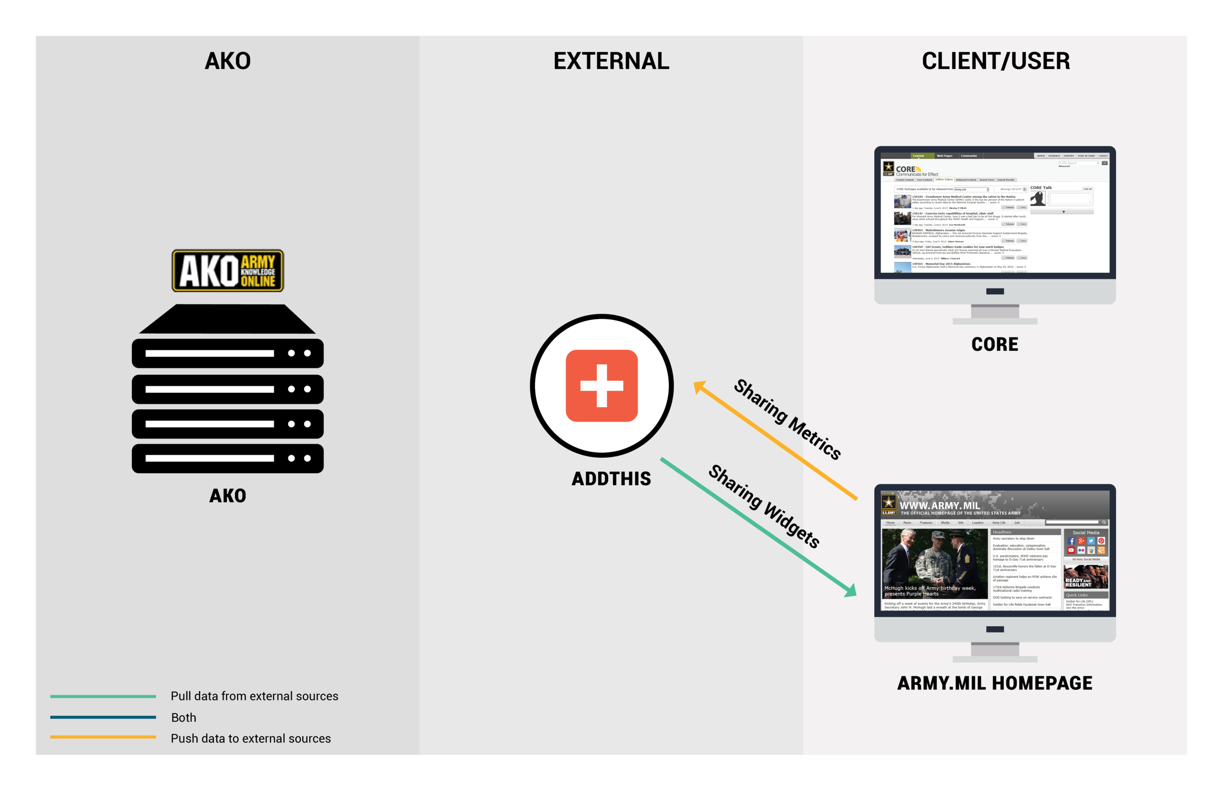
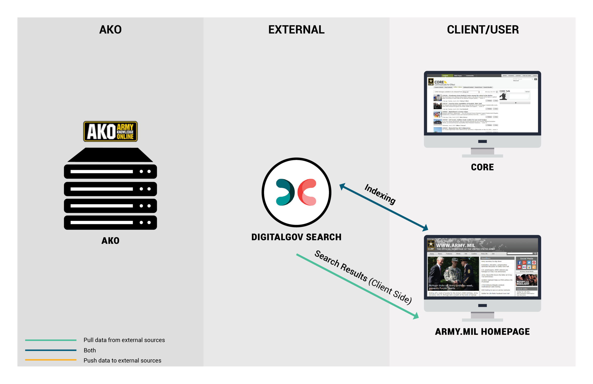
MAPped OUT OUR TECHNICAL ECOSYSTEM
To give the clients insights about how to leverage new and existing assets, I created maps that visualized the company’s digital ecosystem in a way that clearly illustrates their digital properties, the connections between them, and their purpose in the overall marketing strategy.
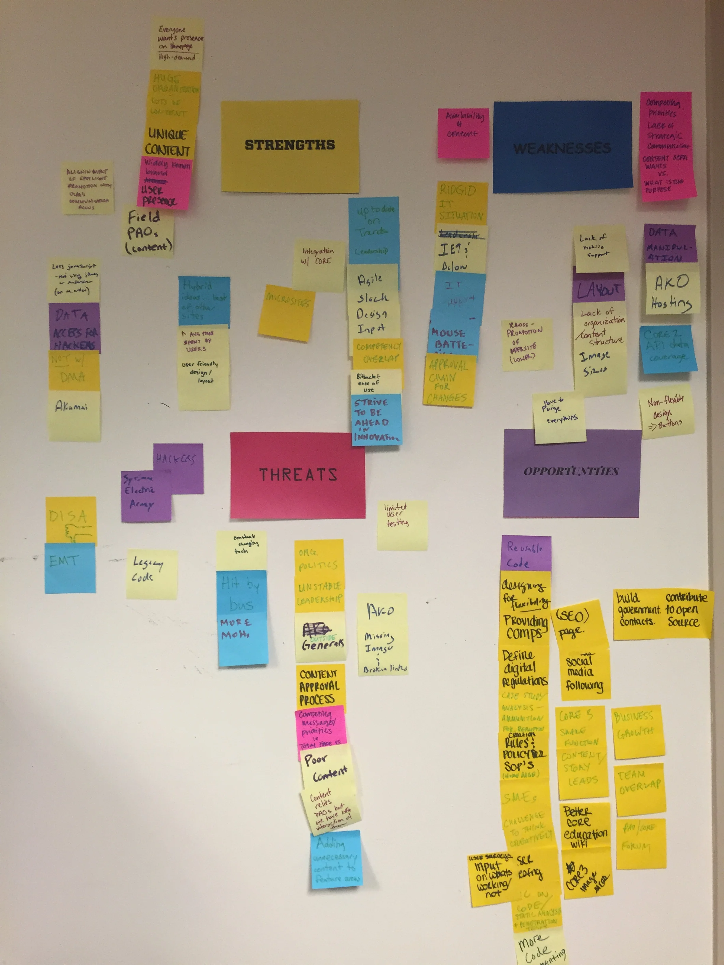
Facilitated An Opportunity Workshop
KEY STRENGTHS:
· Web governance processes and protocols are in place
· Current systems meet mission critical needs
· Publish & feature an extensive volume of unique, high-quality content
· Organizational-wide demand for visibility/exposure on homepage
· 508 accessible and compatible with ie9
KEY WEAKNESSES:
· Web standardization efforts are hampered by DOD culture & structure
· Website is root cause of many customer support requests & underutilized mechanism to deliver support
· Vast library of digital content is not properly managed w/ a technology solution & no set framework to guide digital strategy and site enhancements
KEY THREATS:
· Site user experience is not consistent with industry best practices & visitors expect a Web experience on par with private sector
· Search rankings on Google will decline because site is not responsive (mobile friendly)
· Left unchanged, website may strain other mission critical operations
KEY OPPORTUNITIES:
· Website analytics can have an increased role to guide digital strategy
· New website will require standardization of content and visual styles
· A new website with a responsive design can serve a growing mobile audience
ConTENT AUDIT
The very first thing I did was an initial website audit where I analyzed the site design, structure, content, and analytics. I performed a content inventory of over 10,000 indexed pages/assets and created a detailed spreadsheet listing. This illustrated the need to make things easier to find and, as I dug deeper, additional issues with the current website became evident.

KEY PROBLEMS:
I discovered that there were inconsistent footer, navigation, logo, and header elements applied all throughout the secondary internal and external organization pages. Not just that, but I found that many outside organizations hadn’t updated their own page with content in years or had completely abandoned publishing any new content all together. In addition, the website was plagued with redundant/ duplicate information and had over 1,000 broken, dead links + 404 pages. A quick walk through the site structure made it clear that the entire architecture would need re-worked. Overall navigation of the site was confusing and there were sections buried within sections on the site.
“A good design is extremely important for websites because it takes users less than two-tenths of a second to form their first impression!”
Analytics Review
KEY METRICS:
An analysis of the content on Army.mil showed us that there were several challenges we would have to overcome. A look at the analytics for the site showed us that more than 40 percent of all traffic to the www.army.mil website is from mobile devices. There was a very high bounce rate for the site. It also showed us that the most common browser used was Internet Explorer and the most visited pages on the site were the Homepage page and leaders’ pages. What was most alerting was the lack of views each news section got compared to the News Front Page(archive). Users were just engaging with the top stories and using the search bar to find articles on these specific topics.

News Section Page Views:
News Front Page: 25.99%
Army National Guard: 8.95%
Army Reserve: 8.09%
Community Relations: <1%
Current Operations: 8.83%
Energy: <1%
Environment: 1.57%
Health: 2.79%
Human Interest: 2.72%
Inside the Army: 5.02%
Science & Tech: 4.95%
Africa: 1.69%
Asia & Pacific: 4.77%
Central/South America & Caribbean: 2.12%
Europe: 4.16%
Middle East: 4.06%
North America: 2.72%
User Surveys
In conjunction with the internal discovery exercises, it was important for us to talk to users to get a pulse on how they felt about Army.mil brand and the current site. I created a standard questionnaire for these surveys that included questions about their relationship with Army.mil, their use of the site, current frustrations, and a wish list for the redesign.
In total, I conducted 20 online surveys with a wide group of people, including veterans, public affairs specialists, pentagon civilians, enlisted personnel, and leadership officials. These surveys gave us an invaluable insight into who the Army.mil real users were, how they use the site, what frustrations they had, and what they wanted to see improved.

KEY INSIGHTS:
Most common frustrations repeated again & again were:
1. Outdated design
2. Text was too small and hard to read
3. Search function didn’t work well
4. Not mobile friendly
5. Too much copy, not enough photos
What activities do you use army.mil for?
100% Browse/reading news
60% Directory to organization pages
60% To find info on leadership messaging/ policies/ updates
40% PR press releases
30% Go to microsites as research/educational tool
10% Content curation
What content items would you like to be prominently featured on the home page?
100% Top News Stories
90% AKO Portal Links
80% Featured Video
80% Featured Photo
75% Stand-To!
70% Army Initiatives/Campaigns
Is there any information that you could not/difficult to find on the site?
1. Press Releases
2. Leaders’ Bios and Photos
When visiting army.mil, can you rate the ease of finding the desired information?
42% Difficult
38% Neutral
20% Very Difficult
What additional information or finding aids would make it easier for you to accomplish your desired tasks on army.mil?
1. Make the search function better (ability to sort by date, author, subject)
2. Quicklinks Section
In what role are you using the website today?
59% Public Affairs Specialists
23% Civilian/DOD employee
7% Enlisted or Enlistees family
7% Veteran or Veteran’s family
3% Leadership officials
1% Educator/student/researcher
Competitive Analysis
DEFINE
Review, SYNTHESIS, & Recommendations
KEY GOALS:
Remove duplicated and outdated content; implement standards that discourage “fluff” and realigned content to display the strongest qualities of the Army and best serve the needs of the primary audience. Develop content strategy for publishing to ensure current, valuable content across all areas of the site.
Restructure the website to focus on usability and navigability by developing an information architecture that focuses on site users and departs from the hierarchical website structure driven by organization motifs.
Develop a cohesive and appealing new visual design incorporating new Army branding guidelines and define digital standards (responsive logo, UI)
Improve search engine optimization to improve website performance and site usage. Optimize content for better performance in search results
Improved functionality(coding/programming) and Update technical design to comply with current technology standards and result in a faster and more streamlined user experience.
Shift to a responsive design framework to ensure that users have consistent access to all content through traditional web browsers, mobile, tablet, and other devices
Develop robust API so that anyone can utilize Army content (content curation efforts) and integrate social sharing in useful, purposeful ways
*CONSIDERATIONS*
Our web team uses an agile and iterative development methodology to incrementally build and improve core functionality, and then scale to meet the broad needs of our user community. This process splits the development schedule into short cycles, known as “sprints,”
Information Architecture/Site Map
Grouped & Labeled Content to Visualize a New Structure and Taxonomy
This chart shows our current site map and tracks the updates we need to make.

IA Workshop: Before (Current IA)
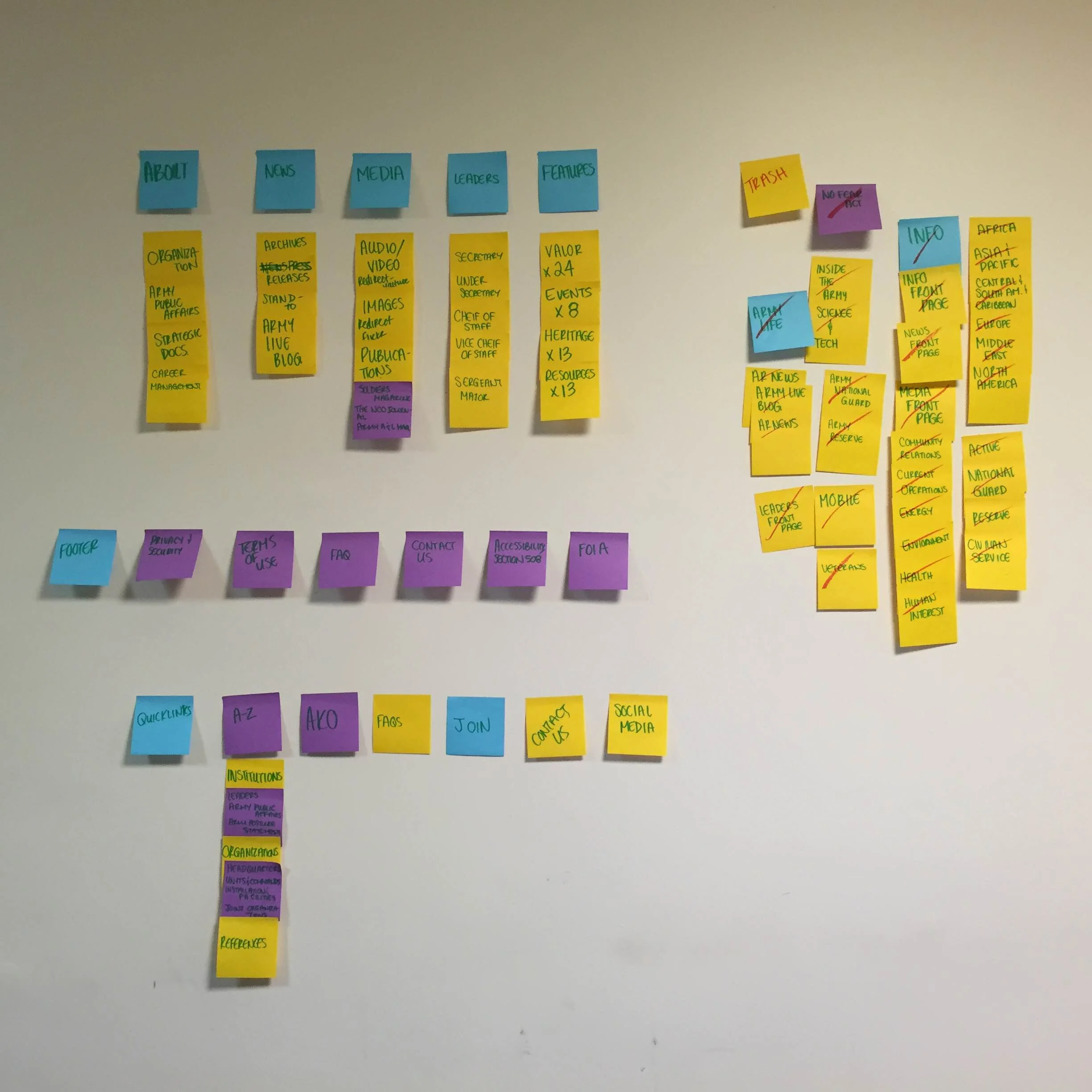
IA Workshop: After (Right side cluster of post-its w/ red slash are deleted pages)

Conducted Online Card-Sorting sessions with current users
One of the goals that was determined during the research and discovery phase, was to reduce the amount of “clicks” it took to land on desired information. The first solution in achieving this was determining the most appropriate content area labels. Verbiage was key, and extensive online card-sorting sessions/studies were done to determine the most successful language and terminology.

Defined Navigation & Created Site Map
New Army.mil Site Map:
More than 10,000 pages of information required re-working. Using the data gathered in preliminary research and by working hand-in-hand with the client, I consolidated all of the websites pages; which made for cleaner more streamlined navigation.
DESIGN
Sketches

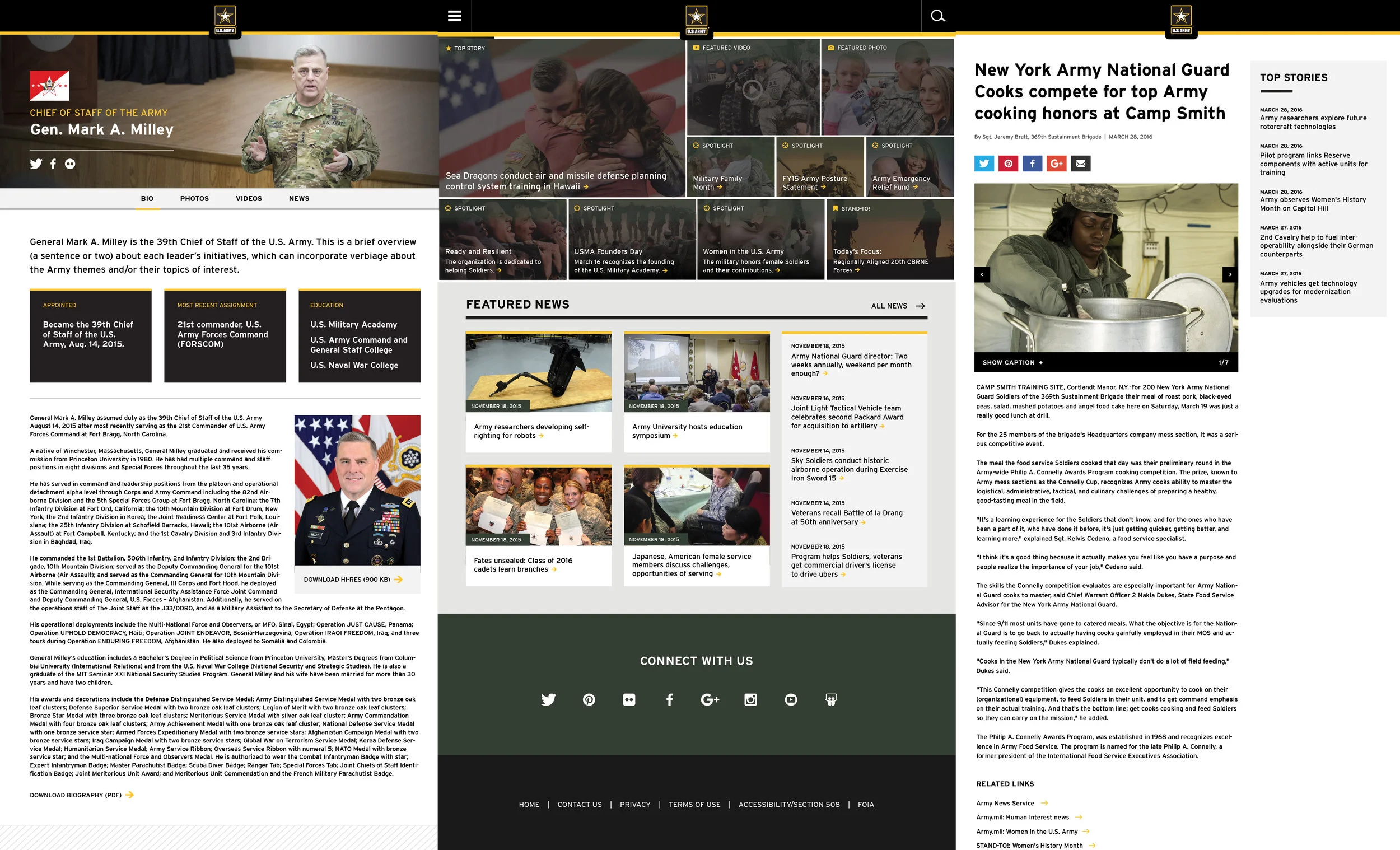
Wireframes & HIGH-Fi MockUPS
I established a few different varieties of page templates and explored what type of consistent components & patterns our team could repurpose from our existing CMS widgets.

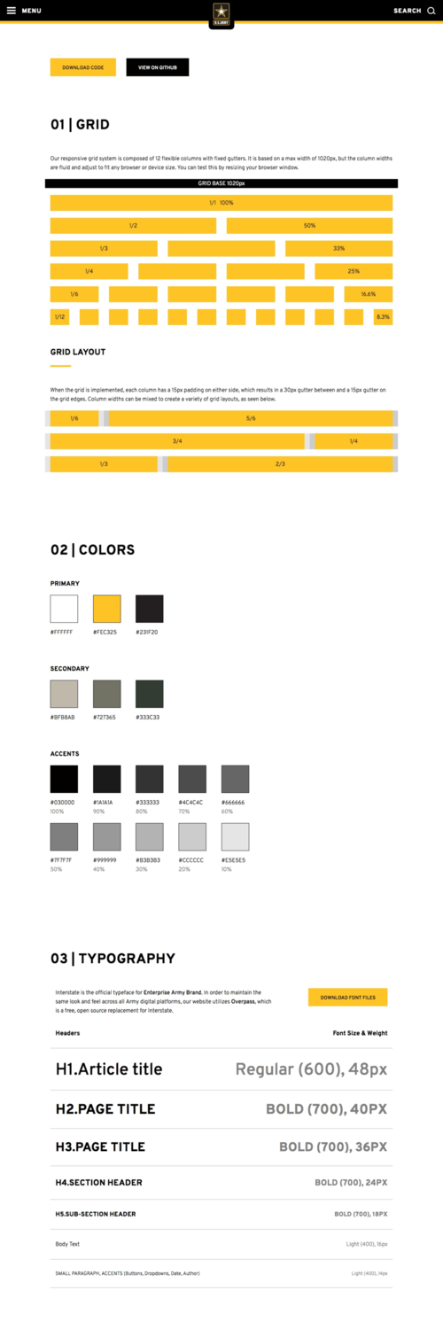
Pattern Library
I defined basic branding & visual styles and collaborated with my dev team to create a repository of reusable components.
View a recap of Project or View Library Online


Responsive Design
As of July 2014, analytics indicated that more than 50 percent of all traffic to the www.army.mil website is from mobile devices—and that number increases every month. However, the army.mil offered no mobile experience whatsoever and Google now penalizes sites that are not mobile friendly with lower search rankings on mobile devices. Looking at these numbers, the top priority of this redesign was to build a responsive site that works across all devices and screen sizes.
A New Visual Centerpiece
The Army constantly has competing strategic priorities (campaigns, commemorations, breaking news, etc.) that require visibility on the Homepage. These priorities changed on a daily basis and at any moment's notice. There is no method to the madness! This was problematic because the current spotlight widget had a limited number of slots and couldn't fit all of the content that leadership wanted to promote; which led to the creation of promotional links/buttons that further cluttered the page. In order, to bring harmony and order to a fluctuating and chaotic amount of content, I decided the best design solution was to create a dynamic modular grid structure that neatly presents a large amount of diverse content. This flexible mosaic-like framework would act as the Army's virtual "digital bulletin board" and allow the Army to easily promote different types of high priority content within one cohesive structure. Through the calculated use of grids, we crafted a system of components that could be repurposed around the site, naturally translating to mobile or tablet devices.
User Friendly Navigation and Menu Bar
I implemented a new data-influenced navigation structure and design that focused on providing relevant information to new users; while still providing current internal audiences entry points to the most-used sections of the army.mil ecosystem. In my preliminary research, I discovered that the internal audiences expected to be able to access certain areas of the site from the homepage, so I determined what the most clicked links on the homepage were and moved them into a Quicklinks section in the navigation. Secondary navigation items that didn’t get many clicks moved to an extensive A-Z index “Everything Directory” and an improved search feature (with advanced filtering and auto-suggestions once you type three characters) rounded out the options for easily locating content.

DESKTOP

MOBILE

TABLET
FINAL THOUGHTS + NEXT STEPS
“The Army.mil team has done an exceptional job of development of the new Army.mil site, all while keeping Army priorities at the forefront. They’ve done their research. The Army.mil team has put a lot of effort into delivering a great new website that shares the Army’s story, and we are really proud of the result.
”
The complete redesign of the site didn’t happen overnight. It occurred very strategically.
To start, we first launched the new navigation bar over the entire existing website and then pushed the new homepage. Next, we targeted the highest impact navigation items and then initiated the new design skin one section at a time. For each intermediate change, we asked for feedback from our users and conducted small usability workshops during our lunch hours. This consisted of finding pentagon employees and observing them using the new portion on their phones or desktop computers.
SUCCESS METRICS:
Six months after the entire new site launched, we looked back at our analytics and identified major improvements.
Page views increased by 150%
Bounce rates decreased by 25%
Average user session increased by 3 minutes.
Social shares (sharing content on the website) increased by 30%
Read more about the launch in these news articles:
Army launches new website on 241st birthday
The New www.ARMY.mil