

BEFORE: Old Newsletter Template
Silicon Labs Newsletter Redesign
Background
Silicon Labs recently updated its website with a refreshed look and feel and wanted their new brand identity to be reflected across all of their digital assets. Besides having an inconsistent appearance, the newsletter’s design was fairly basic, allowing the content to speak for itself. While simple is good, there were several missed opportunities in the old template that needed some attention in order to take the experience to the next level.
IMPROVEMENTS
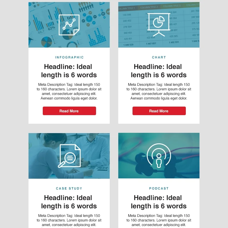
1) One of the unique features of the newsletter was that it featured a wide variety of content. To make it easier for the user to distinguish between the 10 different types of content I created custom icons to overlay on each modular block and also added a typographic content type label identifier.
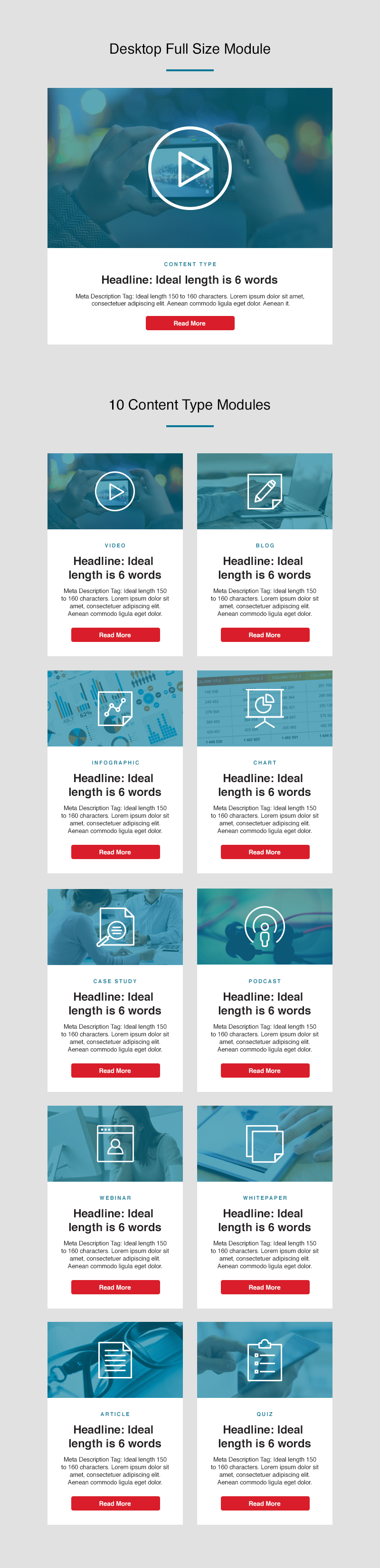
10 Custom Content Modules
2) Next, I incorporated the same color scheme, call-to-action buttons, and footer style elements that are featured on the current site to create a stronger on-brand representation.

Current SIte Design Reference

Mobile Low-Fi Mock-up

Desktop/Tablet Low-Fi Mock-up
3) Finally, I focused on developing a mobile-optimized design that functions well across a range of screen sizes. To achieve this, I keep the kept the content brief and organized into modular blocks that seamlessly stacked on top of each other as the screen size is reduced.
Due to a non-disclosure agreement, I am unable to share/elaborate further information on this project via online. Please contact me for follow-up questions.