

U.S. Army News and Information App


PROBLEM:
The existing version of the app was outdated and had severe usability and functionality issues. The image galleries were broken and didn’t display captions or allow users to view more than one photo. There was an abundance of duplicate stories and content in the news feed. The text was too small which resulted in complaints of readability issues. The navigation was very disorienting and users were getting lost within the experience, forcing them to quit all together.
DISCOVERY + RESEARCH
Feedback/Survey Analytics:
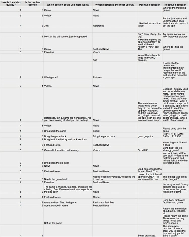
I first collected & reviewed feedback surveys submitted by current users of our existing app to identify the common pain points and areas of frustrations in the user experience. This helped me understand what areas needed improvement. Please click on the survey image to enlarge my findings. >
Comparative/Competitive Analysis:
Next, I conducted a competitive analysis of 4 similar news and military service apps to identify effective solutions and key beneficial features + functionality that would ensure a great user experience. This gave great insight on how to solve/improve various usability issues and helped guide my idea generation moving forward. The diagrams explain the types of services each app provides and the pros and cons of each.
DEFINE
User Personas:
Based off of interviews, I developed 2 personas that embodied the different needs and priorities of our service members.
Stakeholder Interviews:
I sat down with the client to understand their goals, success metrics, and discuss the key findings that resulted from my initial research. Guidance from this interview helped to solidify the direction and vision for the product.
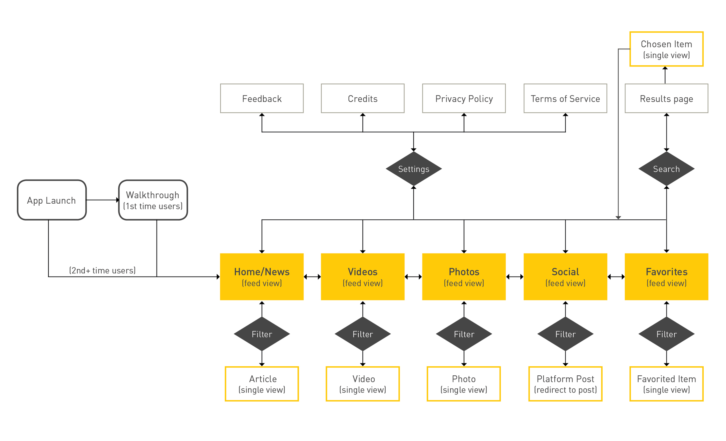
User flow/Information Architecture:
DESIGN
Initial Sketches:


FEATURES OF THE NEWLY DESIGNED EXPERIENCE:
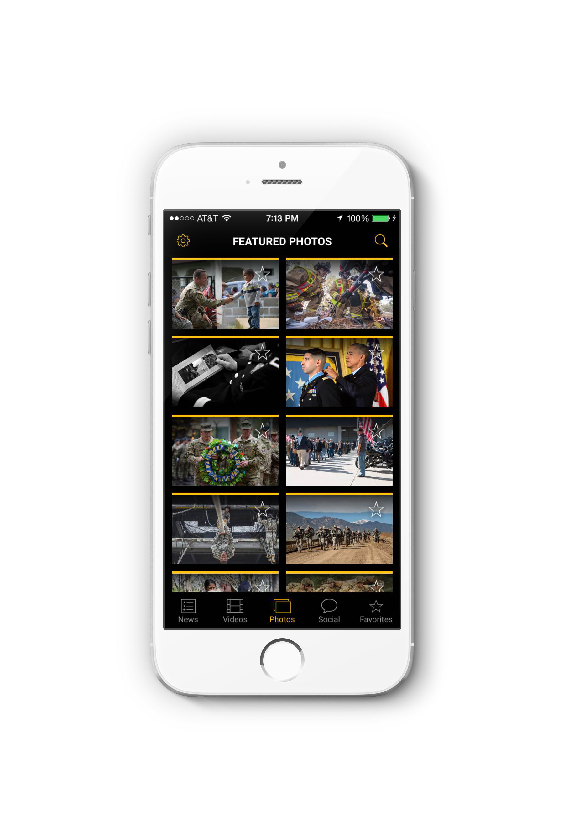
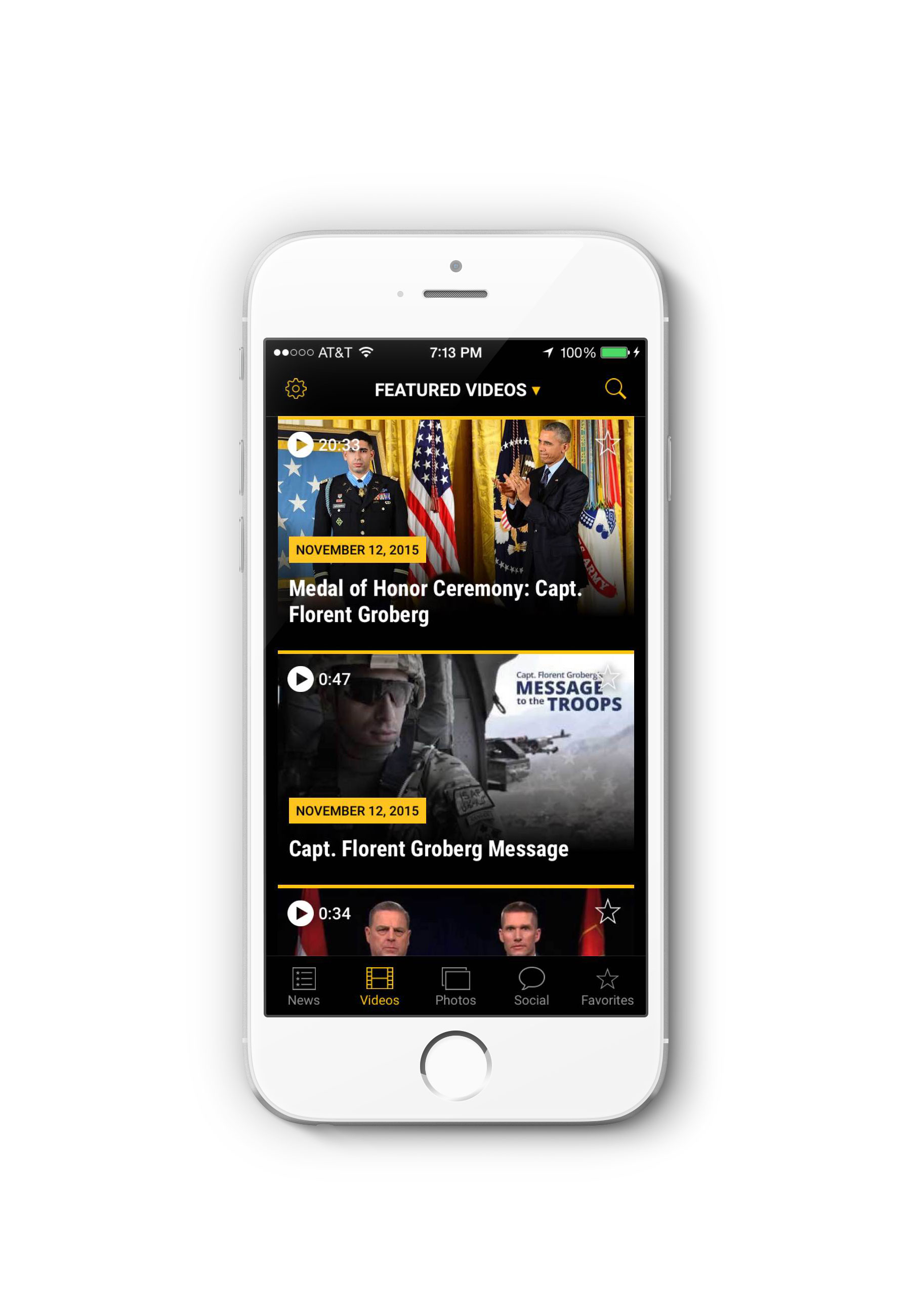
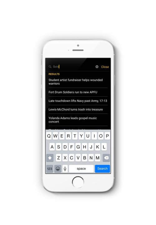
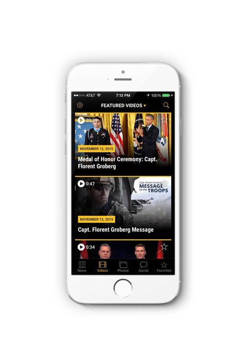
Search and browse the latest news, photos, and videos directly from a mobile device
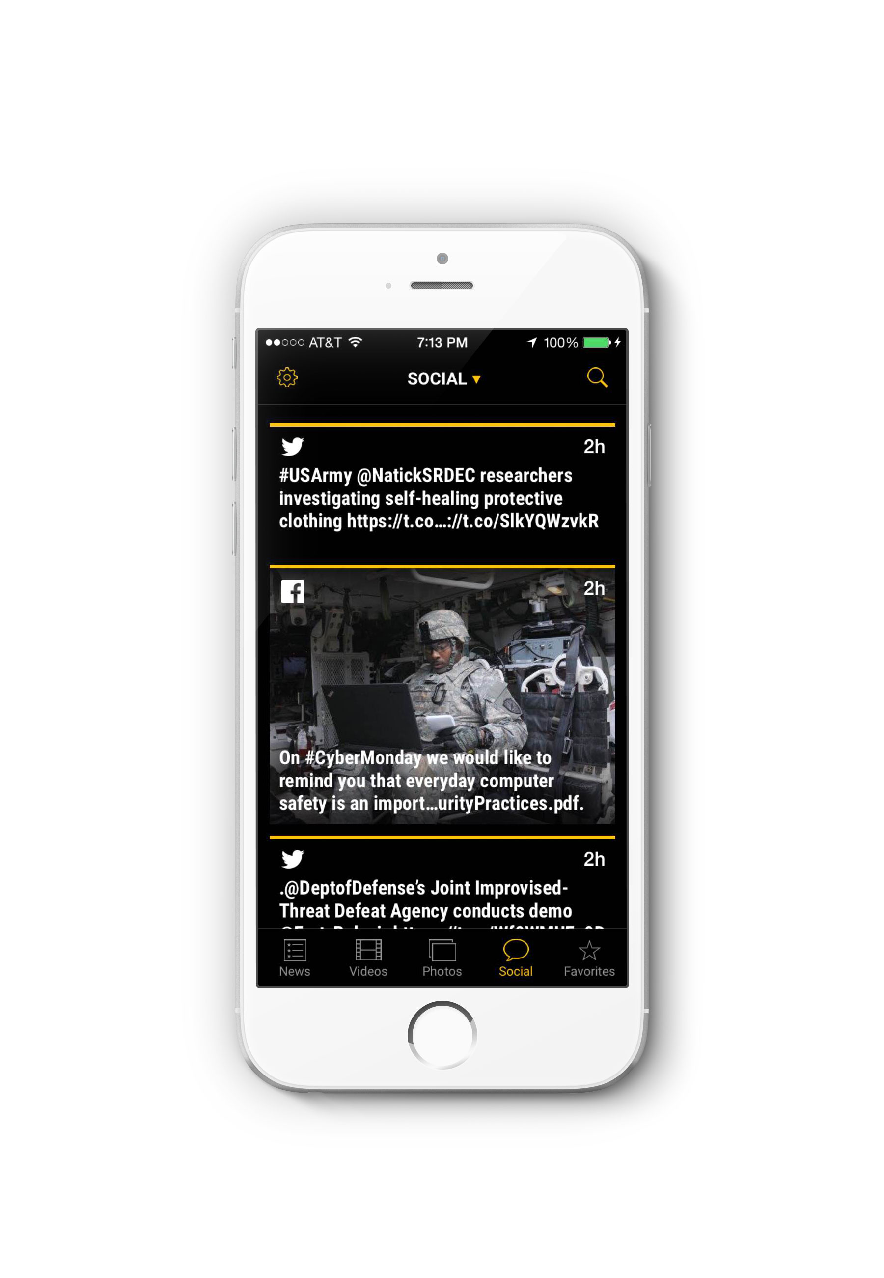
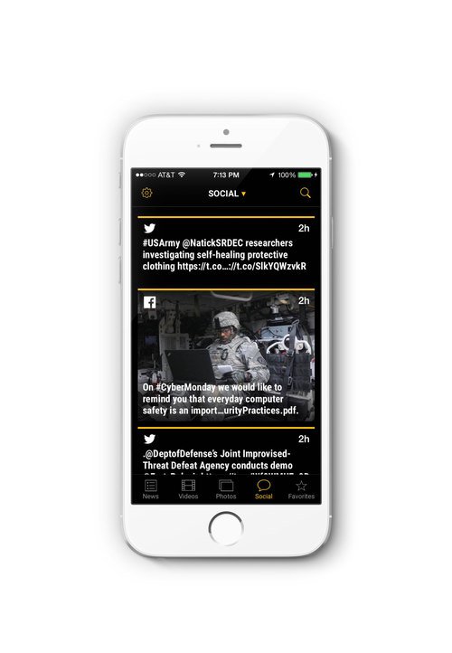
Keep up-to-date with an aggregated social media feed from all Army social media platforms.
Save favorite content & articles on personal device for offline viewing.
Share news and media with friends via email, text, Twitter, and Facebook.
Opt-in push notifications on important news from the United States Army.
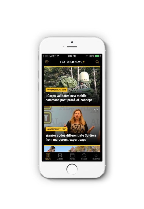
VISIBLE & EASY TO ACCESS NAVIGATION:
Put the main navigation in the “thumb zone” so it is always available and allows for rapid switching between features.
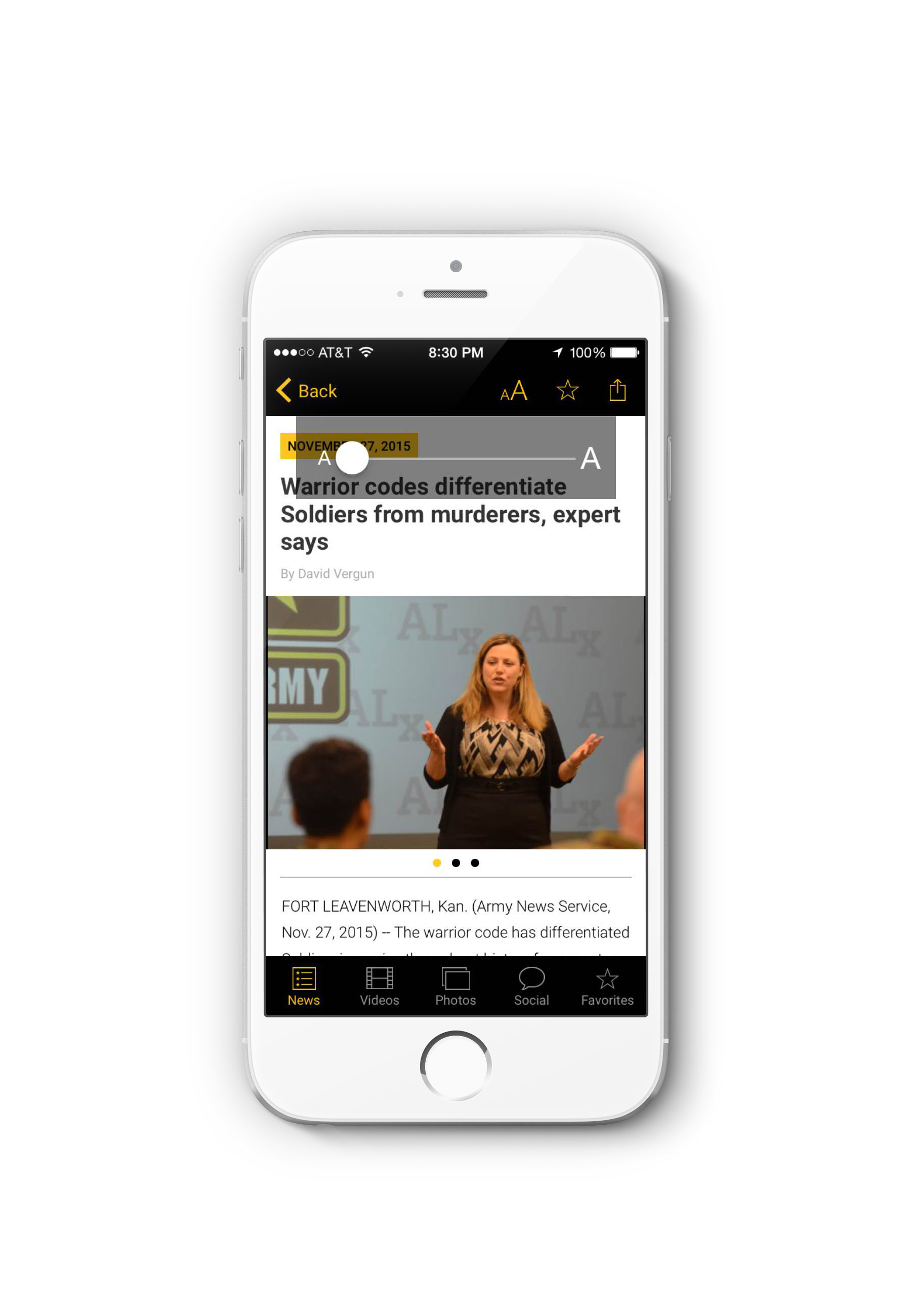
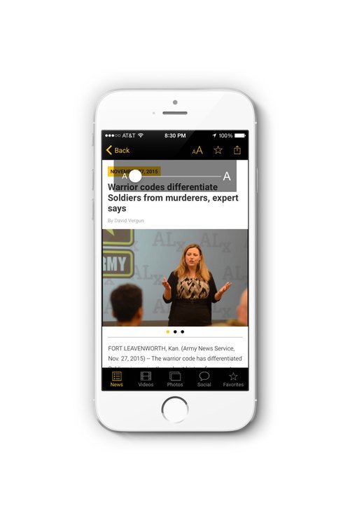
TEXT RESIZER:
Makes the text easier to read and gives the option to change the font size of the article text.
APP STORE RATINGS:
4.5 out of 5 stars

Usability Testing:
METHOD:
During lunch hours, I walked around the Pentagon courtyard and asked strangers if they were interested in testing out a cache beta version of the app. For each one-on-one interview, I asked the user to complete a series of tasks while observing their interaction and watching how they would go about advancing to the next step. Overall, I administered a series of 13 usability tests with a diverse set of participants.
RESULT:
After the initial first round of testing, all 13 participants successfully completed each task. While there weren’t any major usability/interface issues identified, it became apparent that the younger users (35 yrs. & younger) were more digitally literate. This was evident in their ability to complete a given task in a quicker response time. Moreover, there was a noticeable 3-5 second lag/contemplation period in users older than 45 years of age due to them not being as well versed in digital interaction patterns and cues.
However, after further inquisition I learned that they were able to discover the functionality due to the interface being easily learnable. Despite a user not being as familiarized/technologically savvy, they still ended up being successful due to “stumbling upon” the correct action which in turn allowed them to form a lasting behavioral association. To aid in the discoverability & learnability of the product, I created a short intro/walkthrough to help familiarize technologically inexperienced users with the interface.
REVISIONS:
I decided to create a short educational walkthrough that introduced key user interface patterns and identify specific functionality to users amongst their first launch of the app.
Due to a non-disclosure agreement, I am unable to share/elaborate further information on this project via online. Please contact me for follow-up questions.